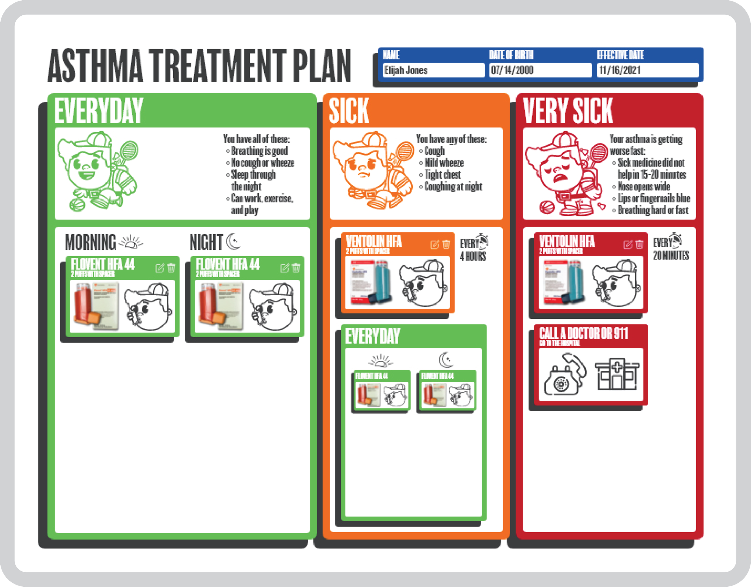
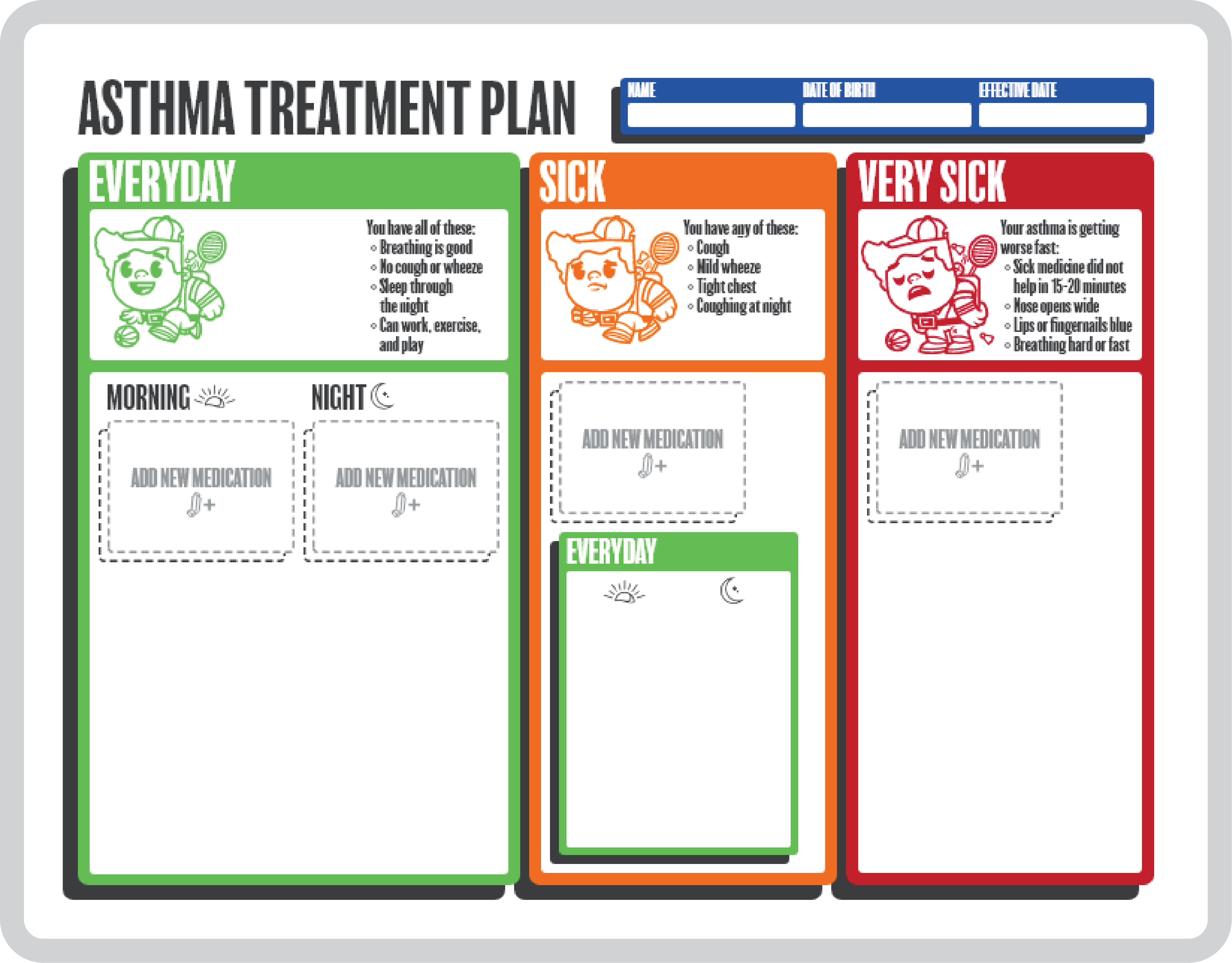
Asthma Treatment Plan
Role
UX/UI Designer
Timeline
2.5 Months
Contributors
Elijah Jones,Dr. Mohammed Jawaad Hussain
Project Summary
In this project I was tasked to design a prototype of a web application that would generate an asthma treatment plan for a doctor to give to their patience. Working closely with Dr. Mohammed Jawaad Hussain I learned of key features that inevitably informed my design. The design had to be easily understood by low literacy patients, be easily printable, and include easily interchangeable medications.
Constraints
Through research provided by Dr. Hussain I was able to get concrete data on effective layouts catered towards low literacy groups. As such when designing I determined two key requirements designing in an 8.5 x 11 aspect ratio for easy screen to paper translations and using a similar pictogram box structure as seen in the research document. Originally I designed the plan in portrait but later swapped to landscape as it provided more space for nicely scaled text and images.
Navigation
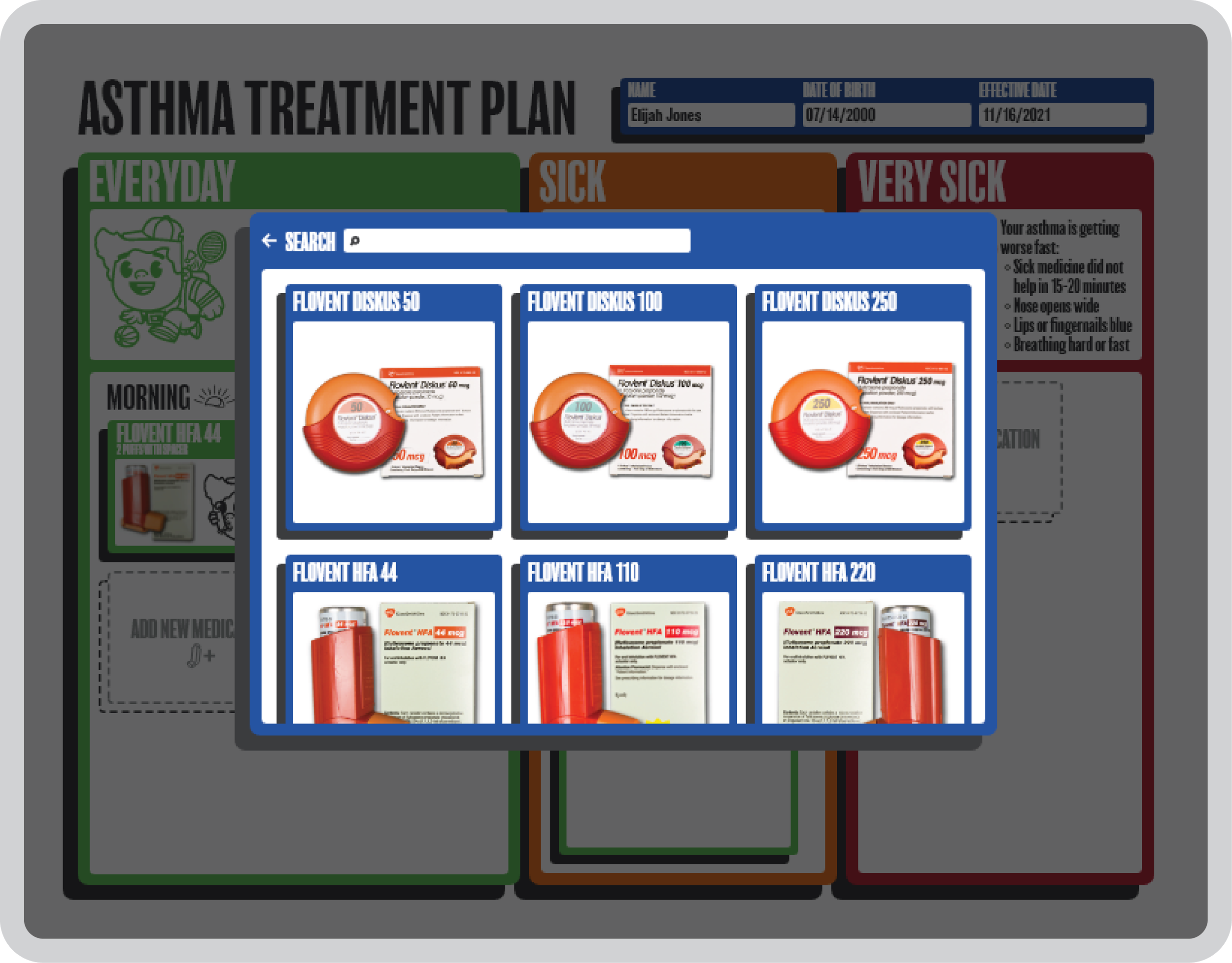
When designing the functionality of adding new medication I decided to use a floating pop-up window to add new medication. Within it I allowed for multiple methods of navigating to the required medication based on user preference. And once selected a doctor can select dosages with the most common dosage set as the default. Organization was a significant priority for me throughout this project both for ease of use and due to the limited space present.
Typography/Aesthetics
Typography was expectedly deemphasized in this project as icons and pictures became the main means of communication. It served the purpose of decluttering the page while more effectively conveying the necessary information. These icons are also helpful within the app when creating the plan to easily guide the doctors through each step. Another subtle change to note is the shift from yellow meaning sick to orange. I chose this because when printing at local hospitals it’s not a guarantee that it will be done in color. By shifting the hue to orange when converted to black and white there is a light to dark gradient where darker is more sick and lighter is healthy which would not exist with yellow as the middle color.


